SPSS Exercises
Demonstration 1: Producing Frequency Distributions
In SPSS, you can review the frequency distribution for a single variable or for several variables at once. The frequency procedure is found in the Descriptive Statistics menu under Analyze. For this chapter, we will use the GSS14SSDS-A data set.
In the Frequencies dialog box, click on the variable name(s) in the left column and transfer the name(s) to the Variable(s) box. More than one variable can be selected at one time.
For our demonstration, let’s select the variable POLVIEWS (respondent’s political views). Click on OK to process the frequency. Respondents were asked to answer the question by indicating 1--extremely liberal, 2--liberal, 3--slightly liberal, 4--moderate, 5--slightly conservative, 6--conservative, and 7--extremely conservative.
SPSS will produce two tables in a separate Output window, a small statistics table (not presented here), and a frequency table. Use the Window scroll keys to move up and down the window to find the statistics and frequency tables for POLVIEWS. What level of measurement is this variable? (Refer to chapter 1 to review definitions.)
In the first table, Statistics, SPSS identifies all the valid and missing responses to this question. Responses are coded missing if no answer was given.
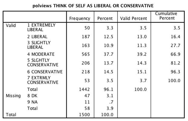
In the frequency table (see Figure 2.1), the variable label is reported. The first column lists the value and value label for each category of POLVIEWS. The next four columns contain important frequency information about the variable. The Frequency column shows the number of respondents who gave a particular response. Thus, we can see that 1,500 respondents are included in the data set, but only 1,442 provided a valid response, with 58 responses missing.
The percent column calculates what percentage of the whole sample (1,500 cases) each of the responses represents. Thus, 10.9% of the total sample indicated slightly liberal political views. In most instances, percentages reported in the third column, valid percent, is more useful. This column removes all the cases defined as missing and recalculates percentages based only on the valid responses. Recalculated based only on valid cases (1,442), the percentage of those who answered slightly liberal is 11.3. The last column, cumulative percent, calculates cumulative percentages beginning with the first response. We know that 27.7% of the valid sample reported that they were liberal (extremely liberal or slightly).
Figure 2.1. Frequency Table for POLVIEWS

Demonstration 2: Recoding Variables
Some variables may need to be recoded or reduced into a smaller number of categories or intervals in order to better present and understand the data. We could, for example, collapse POLVIEWS into a variable with three categories: liberal, moderate, and conservative. To accomplish this, we could use the SPSS commands Transform–Recode Into Different Variables.
For more detailed instruction on recoding variables, please refer to the section on Recoding Variables in the SPSS Appendix on the text’s study site, which explains how to recode the variable EDUC (respondent’s years of education).
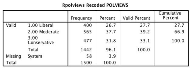
After reviewing the SPSS Appendix, recode POLVIEWS into a new variable called RPOLVIEWS. Frequencies for RPOLVIEWS should look like Figure 2.2.
Figure 2.2. Frequency Table for RPOLVIEWS

Demonstration 3: Producing a Bar Chart
SPSS greatly simplifies and improves the production of graphics. The program offers a separate choice from the main menu bar, Graphs, which lists more than a dozen types of graphs that SPSS can create.
Under the Graphs menu, select Legacy Dialogs, and then Bar, which will produce various types of bar charts. We will use bar charts to display the distribution of the nominal variable MARITAL (marital status of respondent). After clicking on Bar, you will be presented with the initial dialog box, with the Simple bar charts option already selected.
Almost all graphics procedures in SPSS begin with a dialog box that allows you to choose exactly the type of chart you want to construct. Many graph types can display more than one variable (the Clustered or Stacked choices). We will keep things simple here, so click on Simple, then on Define. When you do so, the main dialog box for simple bar charts opens.
The variable MARITAL should be placed in the box labeled Category Axis. In the Bars Represent box, click on the % of cases radio button. This choice changes the default statistic from the number of cases to percentages, which are normally more useful for comparison purposes. Click on OK to submit your request. (SPSS automatically excludes missing values. You can change this by clicking on Options. Click in the box labeled Display groups defined by missing values to turn on this choice. Then click on Continue, then on OK to submit your request to SPSS.)
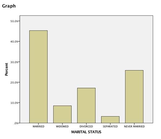
The bar chart for MARITAL is presented in an output window labeled SPSS Viewer. You can see in Figure 2.3 that the bar chart for MARITAL has six bars because the only valid responses to this question are “married,” “living as married,” “divorced,” “widowed,” “separated,” and “single, never been married.”
SPSS graphs can be edited by selecting Edit, then Edit Content, In Separate Window, which moves the graph to its own window (Chart Editor) and displays various editing tools and choices.
Figure 2.3. Bar Graph for MARITAL

Demonstration 4: Producing a Histogram
Histograms are used to display interval or ratio variables. We’ll use the variable AGEKDBRN--respondent’s age when first child was born. Under the Graphs–Legacy Dialogs menu in SPSS, select the Histogram.
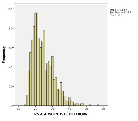
Histograms are created for one variable at a time (that’s why there was no opening dialog box as for bar charts). You simply insert (drag) the variable you want to display in the first empty box. You don’t need to worry about missing values in histograms; unlike the bar chart default, SPSS automatically deletes them from the display. Notice that SPSS includes icons to indicate the level of measurement for each variable. Interval-ratio variables (or scale variables as SPSS refers to them) are matched with a ruler icon. Click on the OK button (on the bottom left-hand corner) to process this request. The resulting histogram is shown in Figure 2.4.
Figure 2.4. Histogram for AGEKDBRN

SPSS automatically decided the appropriate width for each interval based on the range of the variable and the optimal number of bars to be displayed on a screen. The histogram also includes the calculation for mean and standard deviation, which will be discussed in chapters 3 and 4.
SPSS Problems [GSS14SSDS-A]
1. Use the SPSS Frequencies command to produce a frequency table for the variable HEALTH.
a. What is the number of valid respondents?
b. Based on the valid number of respondents, what percentage of the sample reported being in excellent health? What proportion of the sample is in poor health?
c. What is the best way to graphically display this data? Explain.
2. The GSS included a series of questions on respondent’s attitudes about immigrants. In the chapter, we examined the relationship between race and attitudes about immigrants and jobs (IMMJOBS). There are two additional variables to consider--IMMCULT (Immigrants undermine American culture) and IMMEDUC (Legal immigrants should have the same education as Americans).
a. Run frequencies for all the three variables (including IMMJOBS)
b. Prepare a general statement summarizing your results from the three frequency tables. Identify the level of measurement for each variable. How would you describe respondents’ attitudes about immigrants?
3. Produce the frequency table for GOODLIFE (the standard of living of the respondent will improve).
a. What is the level of measurement for this variable?
b. Identify two independent variables that may affect how someone responded to GOODLIFE. Explain the relationship between these variables and GOODLIFE.
c. What is the best way to graphically display this data? Explain.
4. The GSS2014 respondents were asked to report their highest year of school (EDUC). Run the frequency table for this variable. Collapse this interval-ratio variable into an ordinal measure (omitting those who did not respond to the question). How many categories do you have?
a. Prepare a frequency and cumulative percentage table of your recoded EDUC variable
b. Prepare a graphic presentation of your recoded EDUC variable
5. Determine how best to represent the following variables graphically:
a. PARTYID (respondent’s political party identification)
b. NRINCOME06 (respondent’s annual income)
c. LETIN1 (number of immigrants to America nowadays should be)
d. EMAILHR (e-mail hours per week)
Note: Before selecting/constructing your graph, you may want to review the variable by first using the Frequencies or Utilities–Variables command. The levels of measurement for several variables are mislabeled in SPSS. If you are using the Utilities–Variables option to review each variable and its level of measurement, you should confirm the level of measurement by reviewing the variable’s frequency table (Analyze–Descriptive–Frequencies).
