Essentials of Social Statistics for a Diverse Society
Study Questions
Frequency Distributions
The following data are taken from the Eurostat, the Statistical Office of the European Communities. Its task is to provide the European Union with statistics at European level. See the following URL for more details: http://epp.eurostat.ec.europa.eu.
Since the mid to late 1960s, many European countries have seen the rate of population growth begin to slow. This demographic shift has implications for younger age cohorts, as the smaller cohorts of younger persons who must bear the burden of pension and retirement costs for Europe's aging population. Data on the percentage of a country's population in 2007 that is above age 65 are presented below. (Note: throughout this exercise that answer may vary due to rounding).

- Construct a frequency distribution for these countries using the following intervals as categories: <10-12%, 12.1-14%, 14.1-16%, 16.1-18%, >18.1%
- Using the frequency distribution that you constructed in Question #1, construct a cumulative frequency distribution using the same five categories.
- Next, construct a percentage distribution. This may seem like an odd request, given that our categories are percentages. However, what we want to know is what percent of cases fall within each of the five intervals that were listed in Question #1.
- Naturally, we are also interested in the cumulative percentage distribution. Construct this using your answer from Question #3.
- In reviewing your work thus far, suppose that you become convinced that the intervals defined in Question #1 are too broad. Suppose instead that we consider the following intervals: <12%, 12.0%-12.9%, 13.0-13.9%...and so on. Construct the appropriate frequency distribution for these data.
- Considering your answer from Question #5, how many countries have between 14% and 18% of their population over the age of 65?
- Construct a cumulative frequency distribution using your answer from Question #5. Use this to confirm your answer to Question #6.
- Considering your answer from Question #7, what percentage of countries has between 14% and 18% of their population over the age of 65?
Graphical Presentations
The following data are taken from Statistics Netherlands, which collects and processes data for use by policymakers and for scientific research (http://www.cbs.nl/en-GB/default.htm).
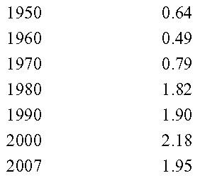
The rate of divorce in the Netherlands has generally been increasing over time. Below are presented divorce rates per 1,000 persons over 7 time periods.

- Construct a time series chart displaying this information. Be sure that you correctly specify which variable belongs on the horizontal and vertical axes.
- Using the time series chart that you constructed in Question #1, describe trends in divorce in the Netherlands before and after the 1970s.
- As is evident from the time series chart you constructed in Question #1, there was a drop in the divorce rate between 2000 and 2007. Does this mean that there were a negative number of divorces taking place? Explain.
- Returning to the original data provided at the outset of this question set, which would be the appropriate graphic devise for these data, a bar graph or a histogram? Why?
- In 2007, the population of the Netherlands was 16,357,992 persons. Total population growth year was 47,407 persons and composed of the following elements:

Excluding administrative corrections, construct a pie chart which shows how each of the remaining four elements contributed to population change in 2007.
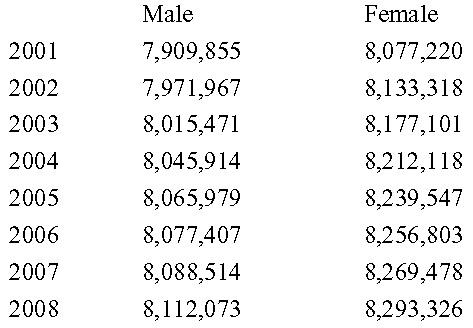
- Provided below are data on the male and female population in the Netherlands over the past 8 years. Construct either a frequency polygon or a time series chart using the data provided which shows changes in the male and female population over the last 8 years.

